excerpt
—
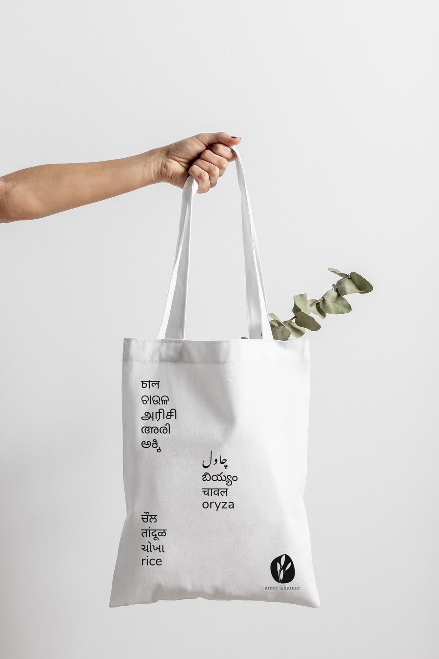
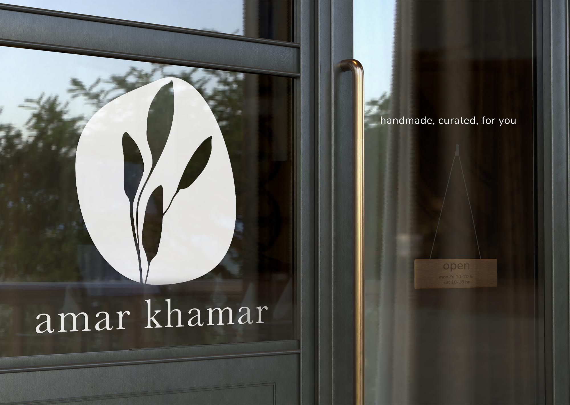
amar khamar, Bengali for my farm, is a grocery store specialising primarily in indigenous rice varieties. Serving an already niche clientele in Calcutta, the pandemic severely curtailed their in-store sales and vision of expansion. Brand re-orientation and a robust and more functional e-commerce website were needed. After market research and brainstorming, I proposed rebranding to attract younger customers across India. From its existing do-it-yourself-Bengali-cooperative aesthetics, I recommend the brand shift to a more handcrafted, premium, and artisanal one—highlighting its core values of sustainability, biodiversity, and fair trade practices. I conceptualised and implemented a visual identity system that would be unique, cost-effective, modular, and easily deployable by the employees without requiring frequent interventions from professional designers.
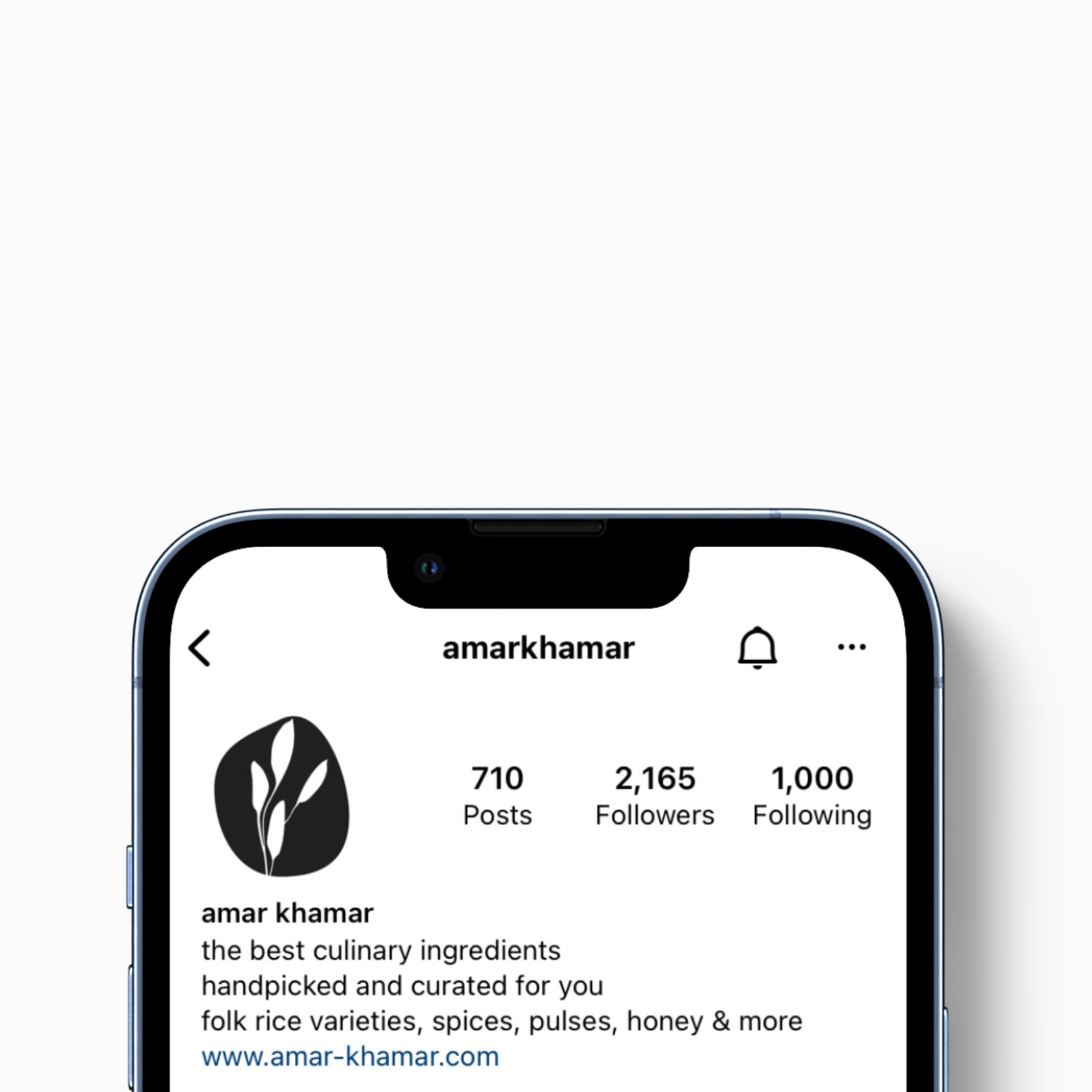
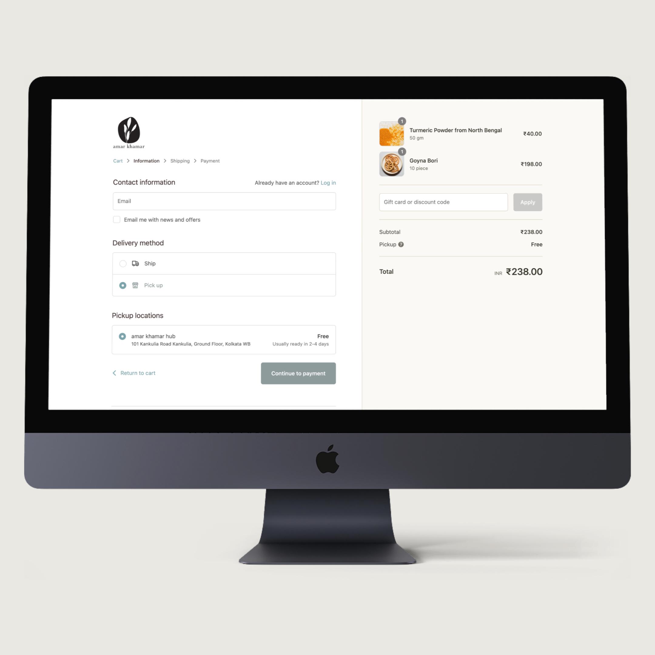
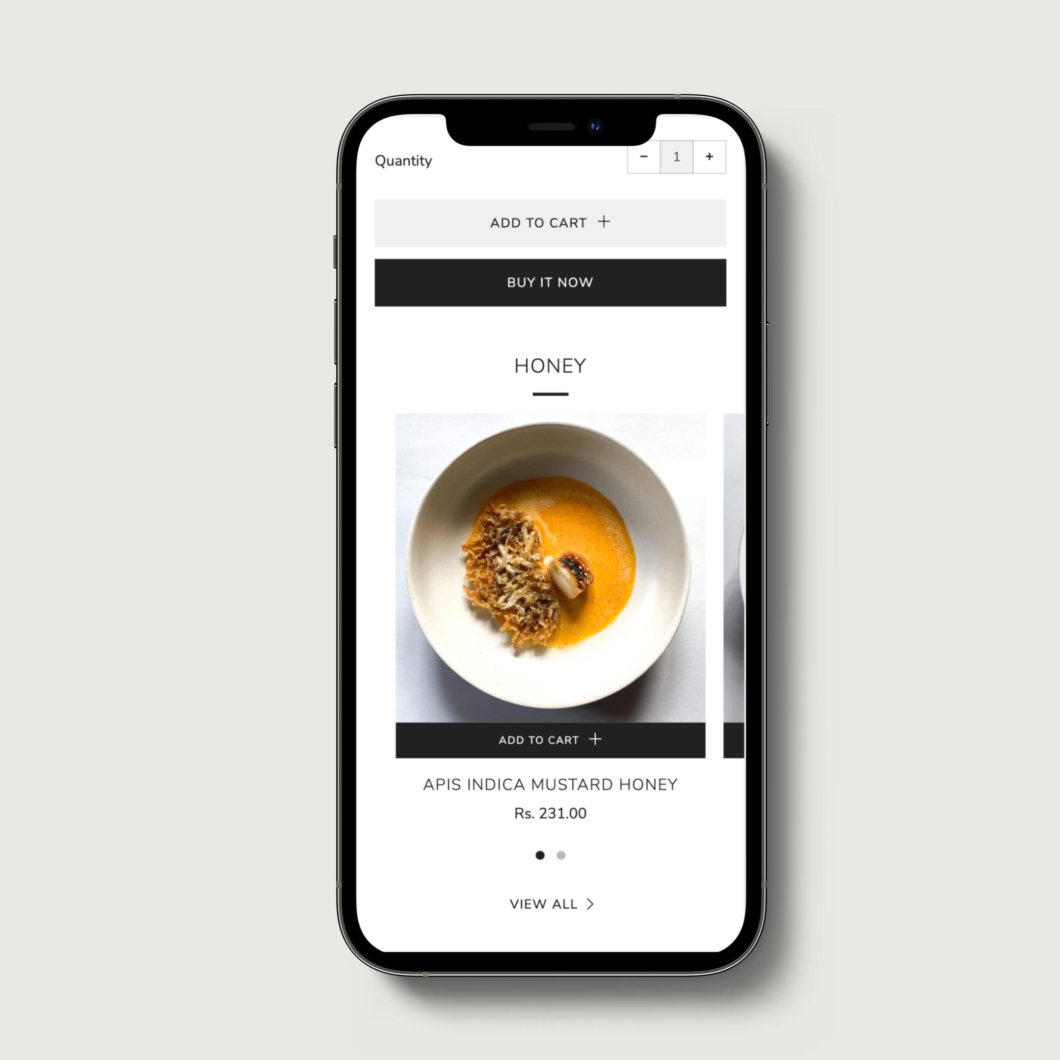
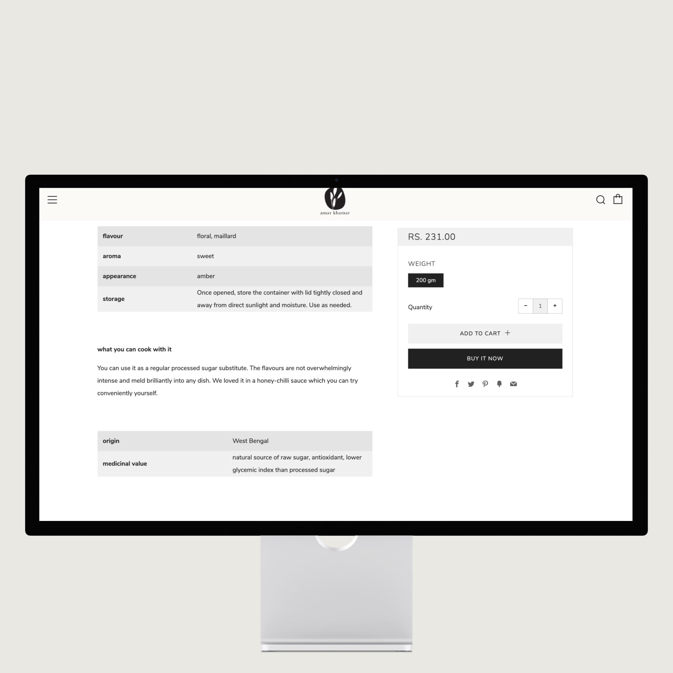
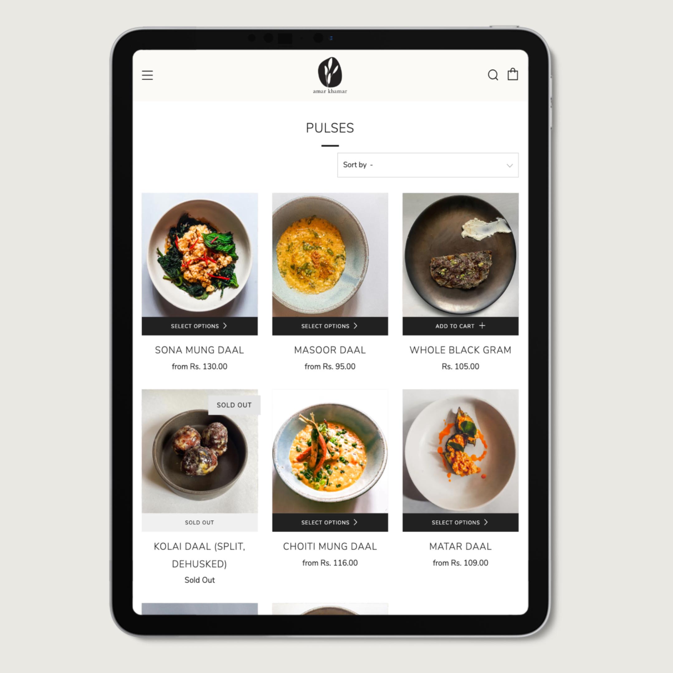
Besides the visual identity, I built a responsive webshop with Shopify, keeping usability in mind for the existing customer base of older individuals. Simultaneously, I art-directed shoots and social media ad campaigns to attract a younger clientele. Next, I designed social graphics, giveaways, and cross-channel marketing material to convey the brand's ethos to its price-sensitive buyers. Finally, I designed packaging that was stainable and cost-effective. Unfortunately, the project abruptly discontinued my services, citing unexpected budgetary constraints after I delivered the brand identity, e-commerce website, marketing materials, and some of the preliminary packaging. Hence, much of the packaging design, search engine optimisation, and training of the employees in brand guidelines and web maintenance remain unfinished.
—
amar khamar, Bengali for my farm, is a grocery store specialising primarily in indigenous rice varieties. Serving an already niche clientele in Calcutta, the pandemic severely curtailed their in-store sales and vision of expansion. Brand re-orientation and a robust and more functional e-commerce website were needed. After market research and brainstorming, I proposed rebranding to attract younger customers across India. From its existing do-it-yourself-Bengali-cooperative aesthetics, I recommend the brand shift to a more handcrafted, premium, and artisanal one—highlighting its core values of sustainability, biodiversity, and fair trade practices. I conceptualised and implemented a visual identity system that would be unique, cost-effective, modular, and easily deployable by the employees without requiring frequent interventions from professional designers.
Besides the visual identity, I built a responsive webshop with Shopify, keeping usability in mind for the existing customer base of older individuals. Simultaneously, I art-directed shoots and social media ad campaigns to attract a younger clientele. Next, I designed social graphics, giveaways, and cross-channel marketing material to convey the brand's ethos to its price-sensitive buyers. Finally, I designed packaging that was stainable and cost-effective. Unfortunately, the project abruptly discontinued my services, citing unexpected budgetary constraints after I delivered the brand identity, e-commerce website, marketing materials, and some of the preliminary packaging. Hence, much of the packaging design, search engine optimisation, and training of the employees in brand guidelines and web maintenance remain unfinished.
I.
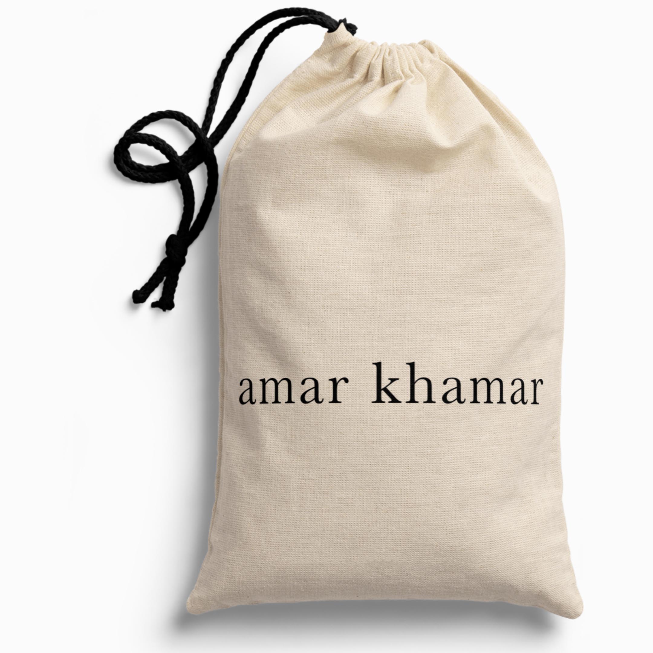
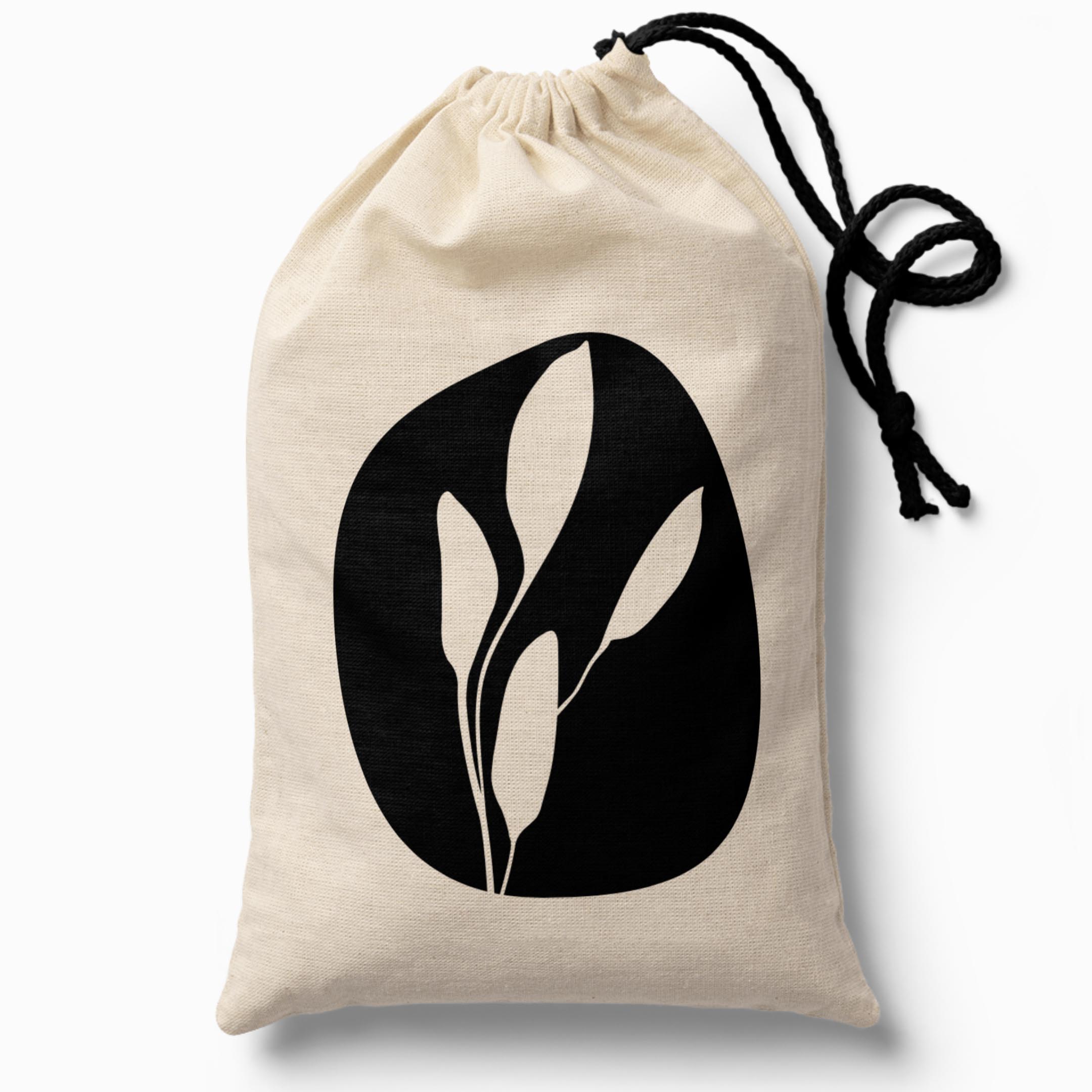
brand identity
︎︎︎Click on the contact sheet for a full-screen view of the imageslogo
—
![symbol]()
![horizontal word mark]()
![vertical word mark]()
![vertical lockup]()
![vertical knockout]()
![horizontal lockup]()
![horizontal knockout]()
—


logo in use
—
![]()
![]()
![]()
![]()
![]()
![]()
![]()
![]()
![]()
![]()
![]()
![]()
—


typography & colour story
—
![latin typefaces]()
![indian typefaces]()
![web]()
![print]()
![palatte]()
![gradient]()
![accessibility: colour blindness check]()
![accessibility: contrast check]()
—


other brand assets
—
![]()
![]()
![]()
![]()
![]()
![]()
—


II.
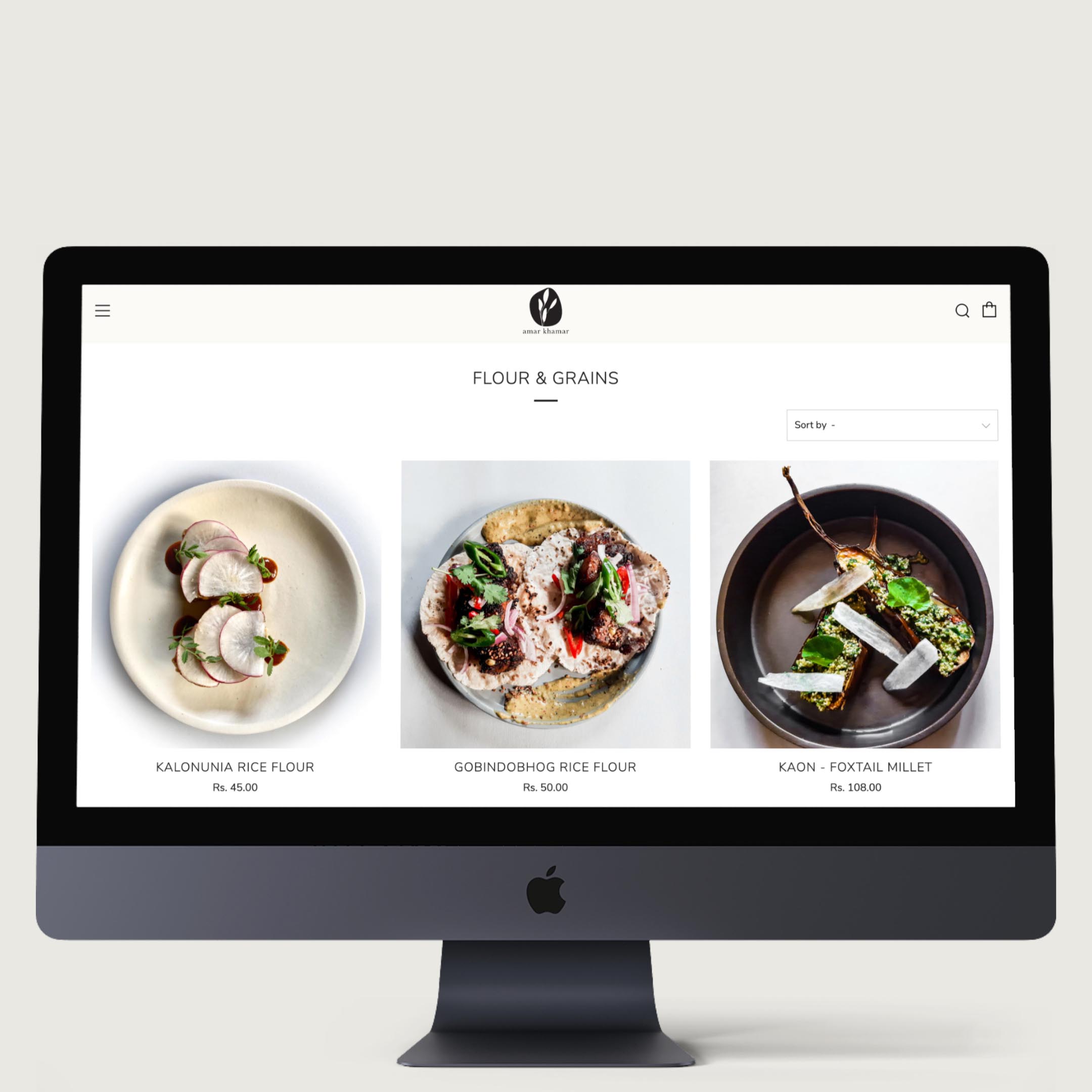
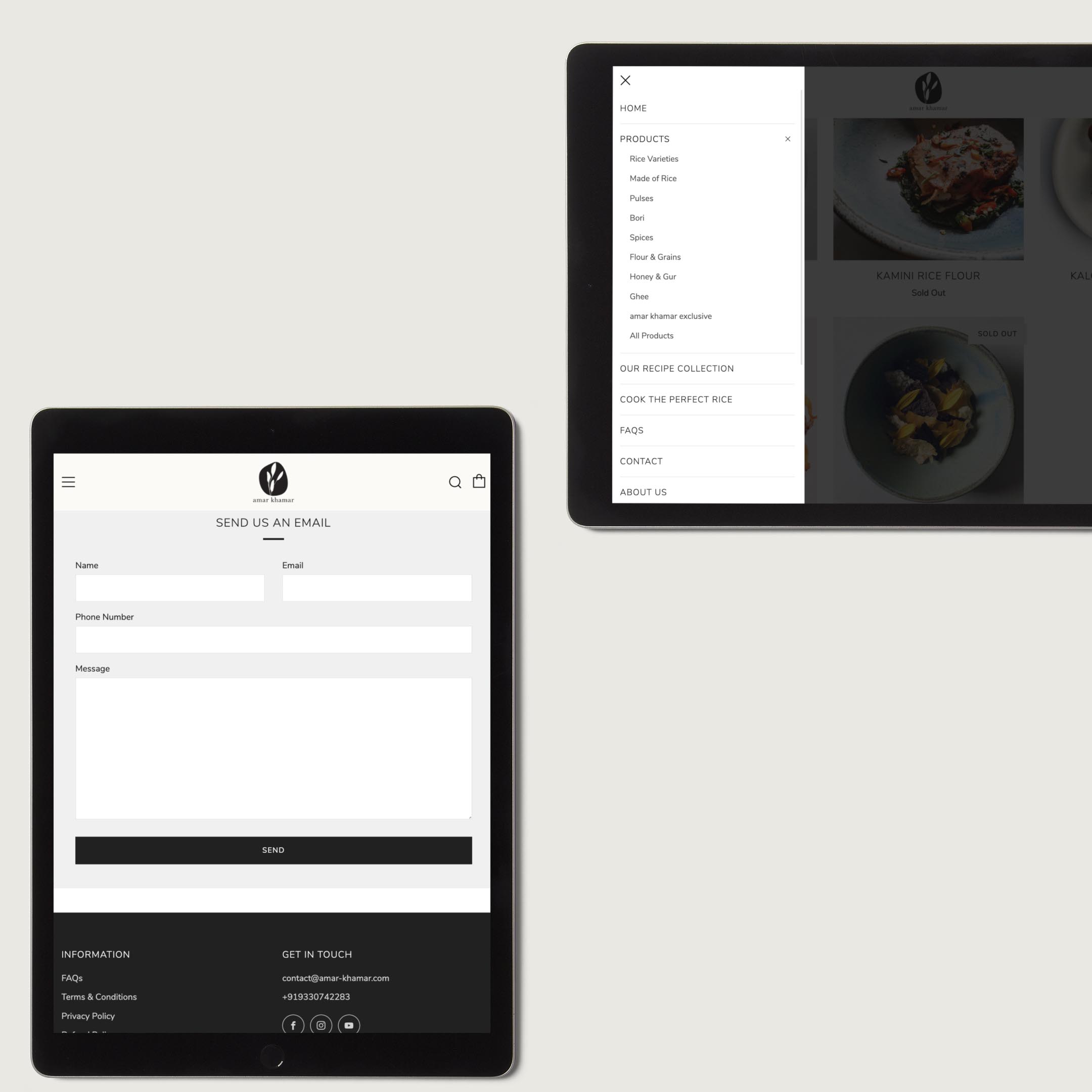
e-commerce website
click on the contact sheet for a full-screen view of the images ︎︎︎
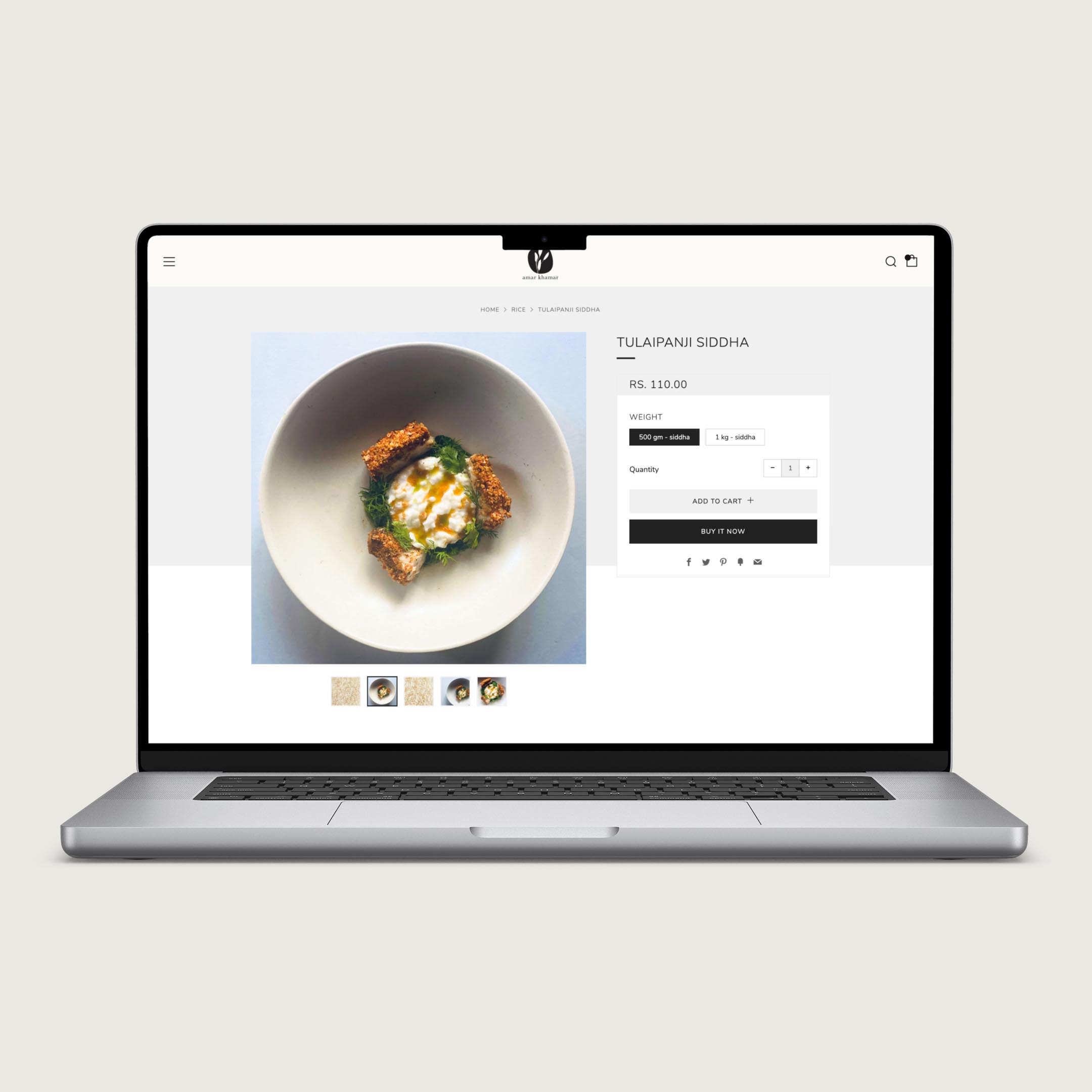
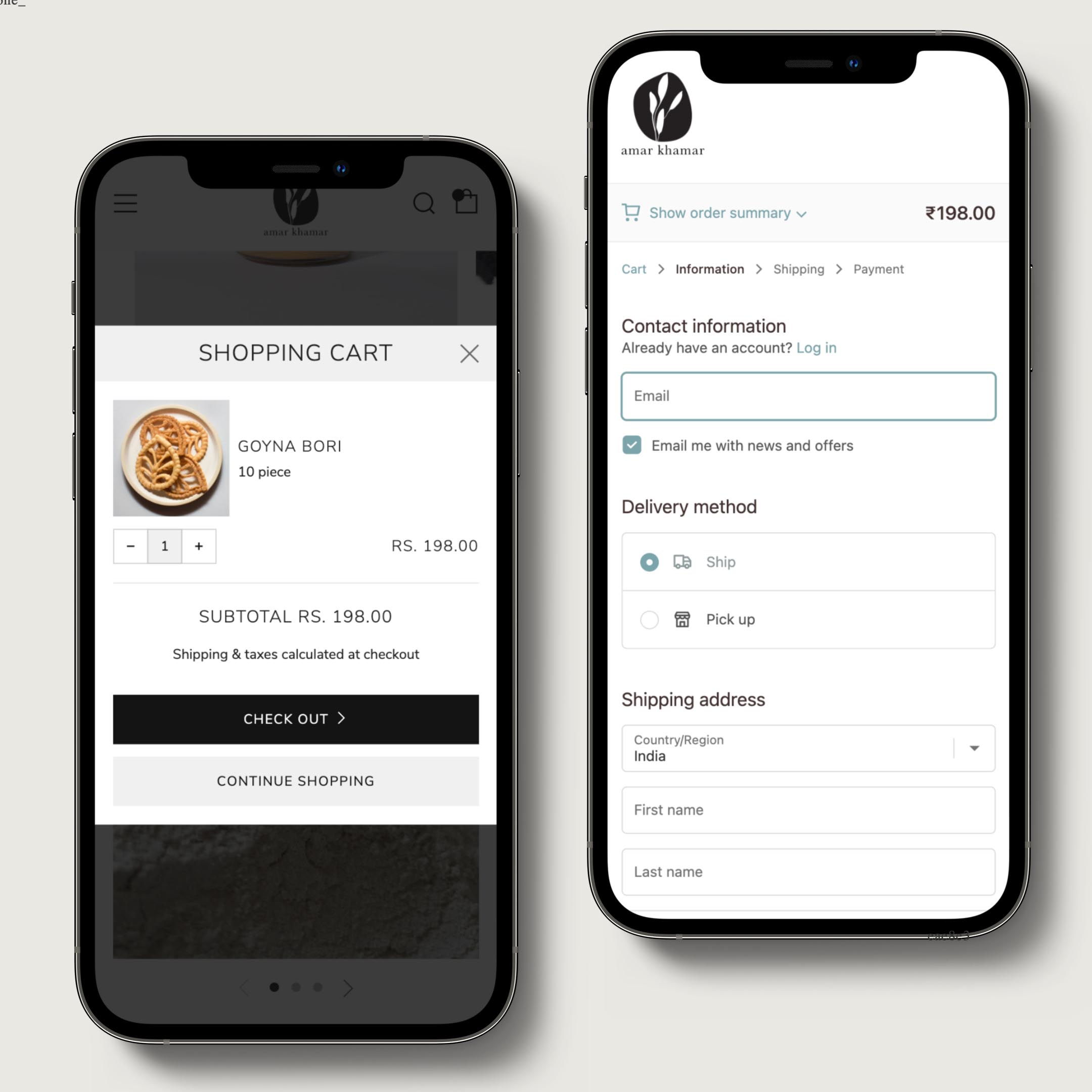
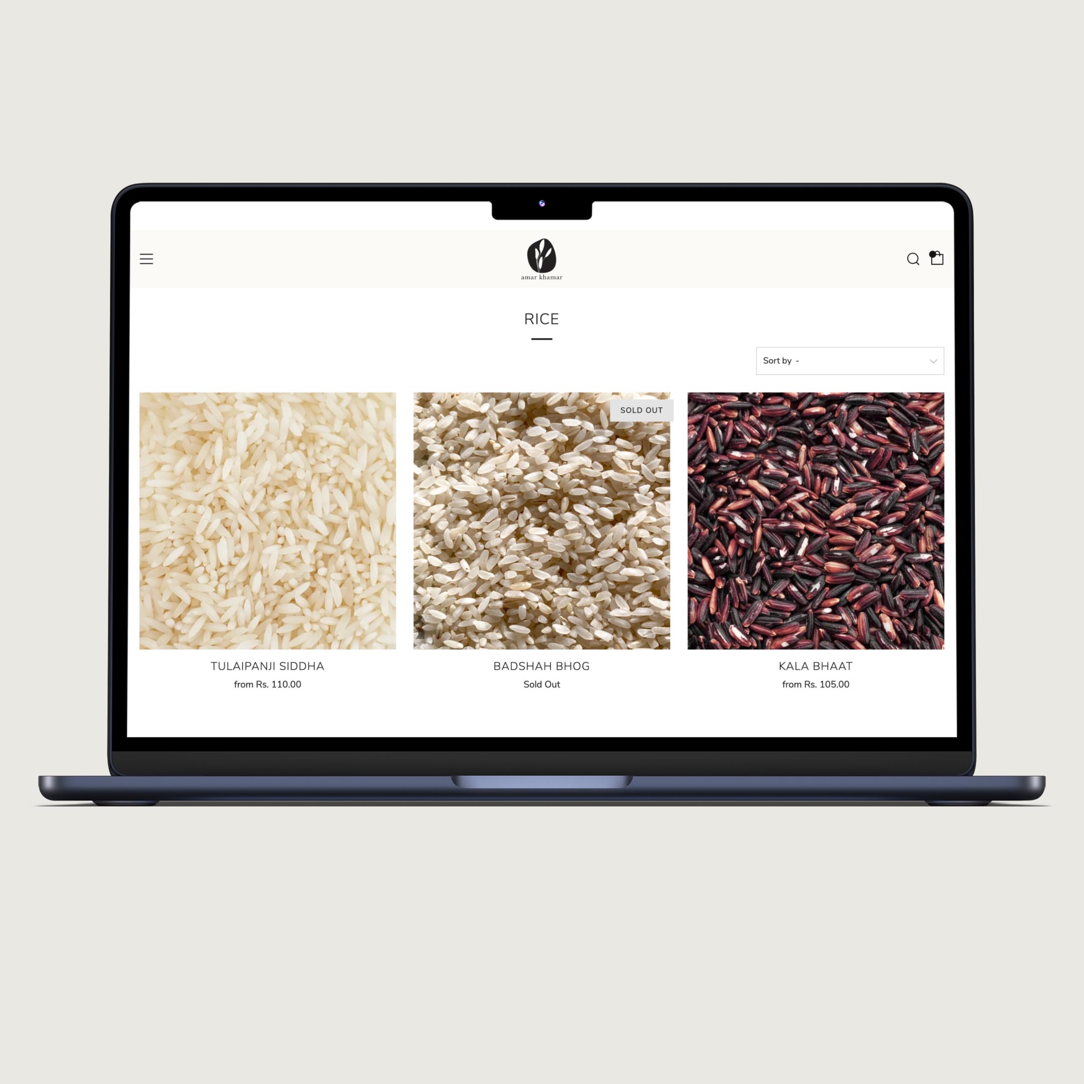
responsive ui design
—
![]()
![]()
![]()
![]()
![]()
![]()
![]()
![]()
![]()
—
art direction
—
—
writeup: remote art direction
imagery usage guidlines: tonality and minimalism
light diagram + camera placement dig
dishes photos: top + side view
product photo with Bengali graphic overlay
illustration + moodboard
imagery usage guidlines: tonality and minimalism
light diagram + camera placement dig
dishes photos: top + side view
product photo with Bengali graphic overlay
illustration + moodboard
III.
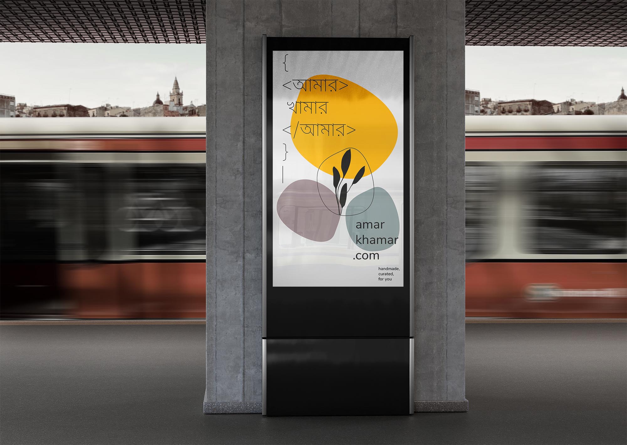
marketing materials
︎︎︎Click on the contact sheet for a full-screen view of the images
cross channel marketing
—
![]()
![]()
![]()
![]()
![]()
![]()
![]()
![]()
![]()
![]()
![]()
—


merchandise
—
![]()
![]()
![]()
![]()
![]()
![]()
—