excerpt
—
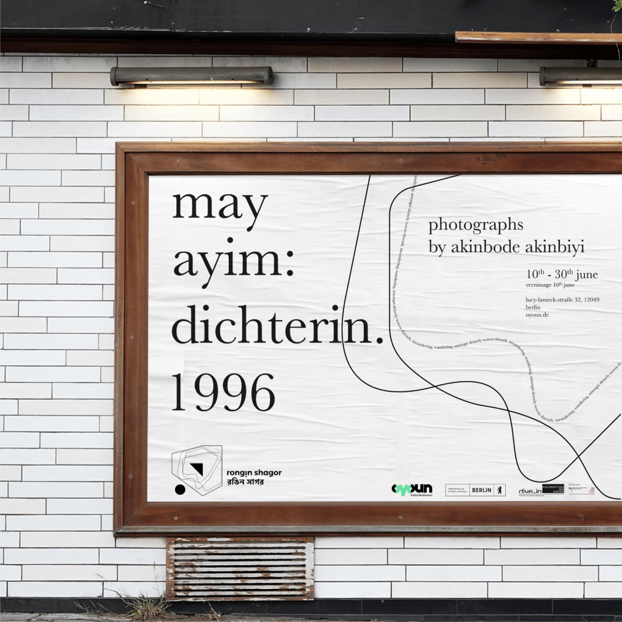
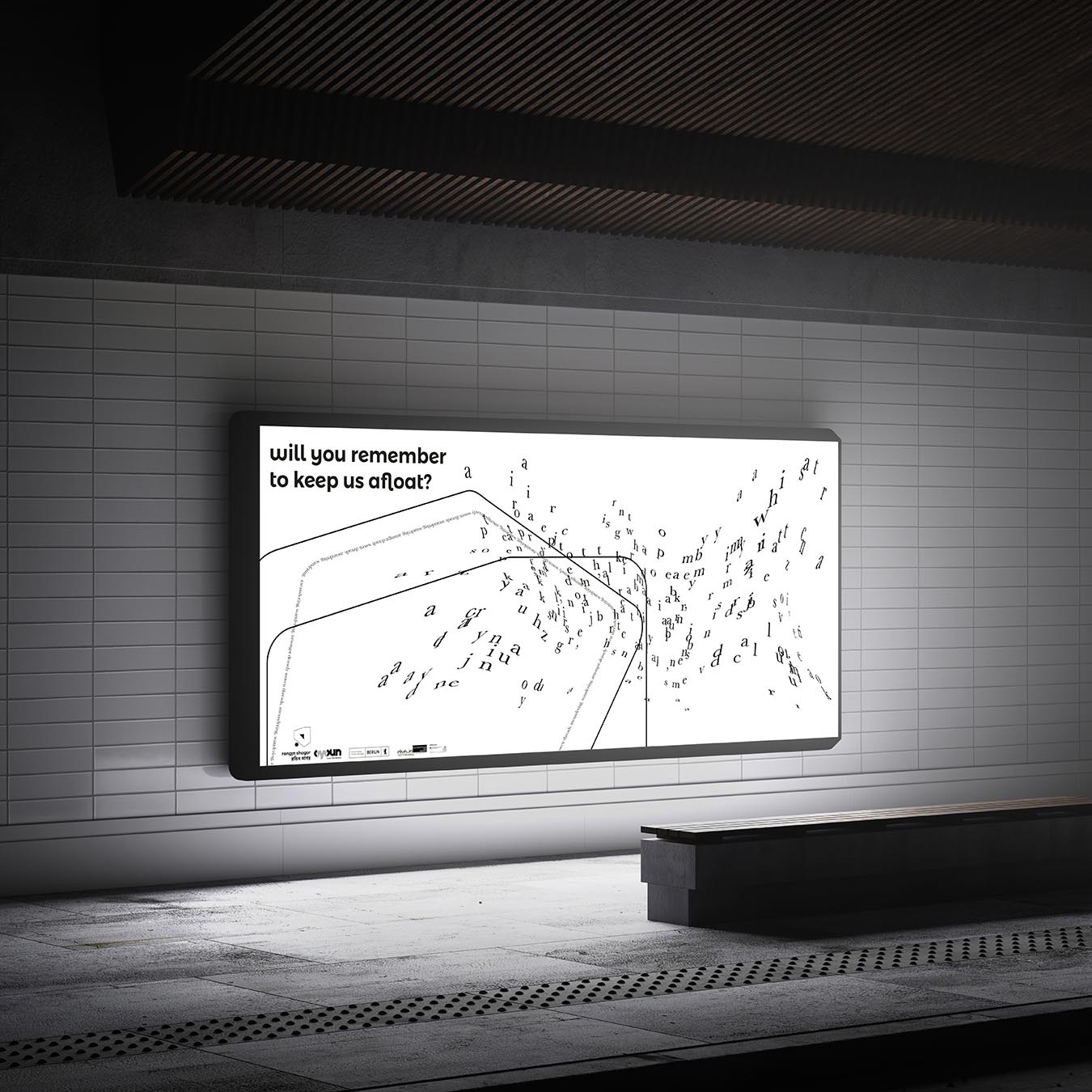
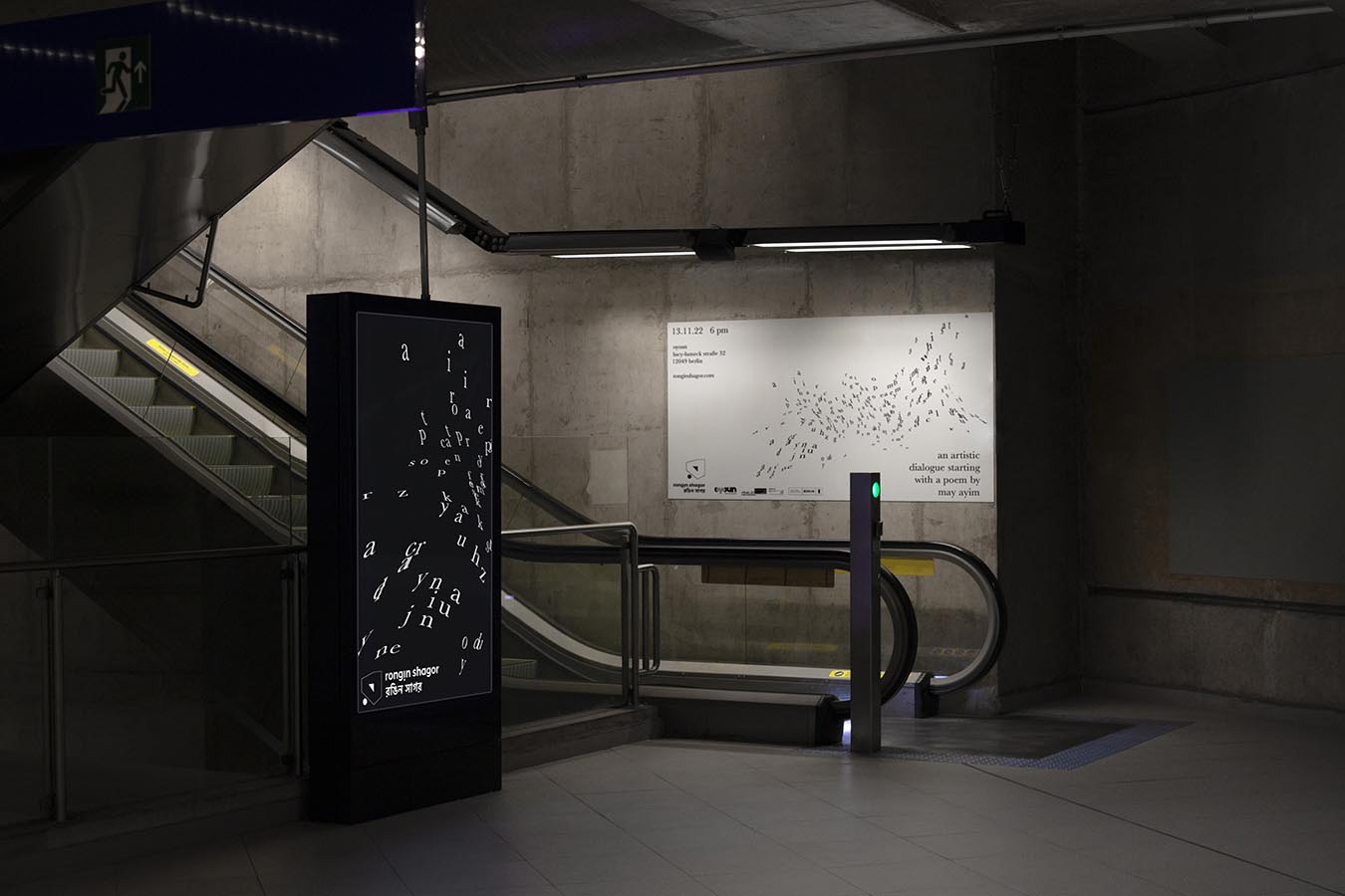
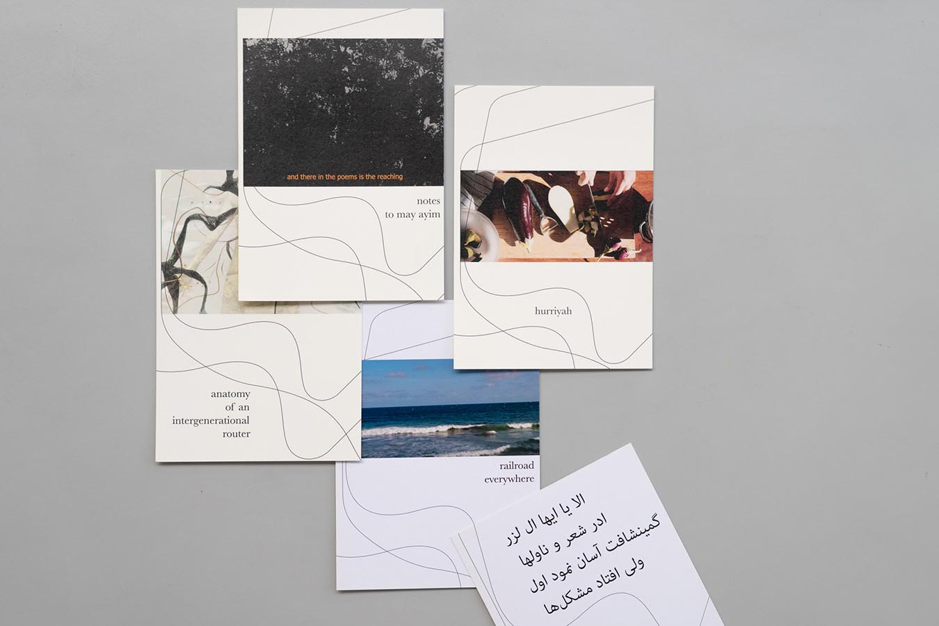
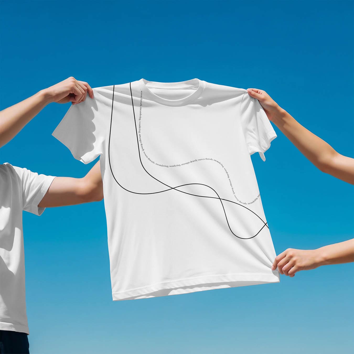
As a multilingual strategic brand designer, I collaborated with Oyoun, a Berlin-based cultural organisation centring decolonial, queer-feminist, and migrant perspectives. I was commissioned to design the visual identity for Rongin Shagor (“multicoloured ocean” in Bengali), a transnational project to foster global artistic dialogue.
Based on the name, I developed a variable brand identity system rooted in the Bengali letter র, which is distorted as a visual metaphor for cultures reshaped by colonial histories. Repeated, offset forms evoke waves and overlapping cultural formations, while the bilingual logo (in Bengali and Latin scripts) ensures international accessibility. The modular identity was applied by other designers and me across posters, digital communication, exhibition graphics, and merchandise, demonstrating a flexible, scalable branding approach for contemporary cultural organisations.
—
As a multilingual strategic brand designer, I collaborated with Oyoun, a Berlin-based cultural organisation centring decolonial, queer-feminist, and migrant perspectives. I was commissioned to design the visual identity for Rongin Shagor (“multicoloured ocean” in Bengali), a transnational project to foster global artistic dialogue.
Based on the name, I developed a variable brand identity system rooted in the Bengali letter র, which is distorted as a visual metaphor for cultures reshaped by colonial histories. Repeated, offset forms evoke waves and overlapping cultural formations, while the bilingual logo (in Bengali and Latin scripts) ensures international accessibility. The modular identity was applied by other designers and me across posters, digital communication, exhibition graphics, and merchandise, demonstrating a flexible, scalable branding approach for contemporary cultural organisations.
I.
visual identity system
logo development
—
︎Click on the contact sheets for a full-screen view of the images
![explorations & shortlist]()
![symbol sketch]()
![line 1 from outline]()
![lines 1 & 2]()
![lines 2 & 3]()
![motif]()
![final symbol]()
![wordmark & slogan]()
![wordmark & slogan]()
![final logo trial]()
—
︎Click on the contact sheets for a full-screen view of the images
variable logo
—
︎Click on the contact sheets for a full-screen view of the images
![symbol components]()
![horizontal logo lockup]()
![vertical logo lockup]()
—
︎Click on the contact sheets for a full-screen view of the images
stylesheet
—
︎Click on the contact sheets for a full-screen view of the images
![colour palatte]()
![gradient: sunrise vibrant]()
![gradient: ocean calm]()
![typography + grid]()
—
︎Click on the contact sheets for a full-screen view of the images


II.
environmental graphic design
︎Click on the contact sheets for a full-screen view of the images
![]()
![]()
![]()
![]()
![]()
![]()
![]()
![]()
![]()
![]()
![]()


III.
merchandise
︎Click on the contact sheets for a full-screen view of the images
![]()
![]()
![]()
![]()
![]()
![]()
![]()
![]()
![]()
![]()
![]()
![]()
![]()


credits
Madhumita Nandi (Concept & Curation) . Anja Saleh (Curation) . Melisa Manrique Oyola (Curatorial Assistant) . Tariq Bajwa (Communication)
︎︎
Visual Identity . Posters . DOOH . Billboard . Postcards . Bag . Tshirt . Sticker . Badge
Madhumita Nandi (Concept & Curation) . Anja Saleh (Curation) . Melisa Manrique Oyola (Curatorial Assistant) . Tariq Bajwa (Communication)
︎︎
Visual Identity . Posters . DOOH . Billboard . Postcards . Bag . Tshirt . Sticker . Badge